A glass corridor links this compact Japanese home’s main house and washroom, framing lake views and turning daily movement into part of the design.
A route that becomes part of the house
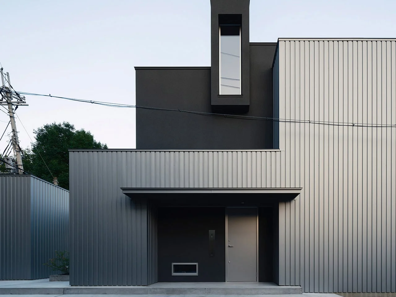
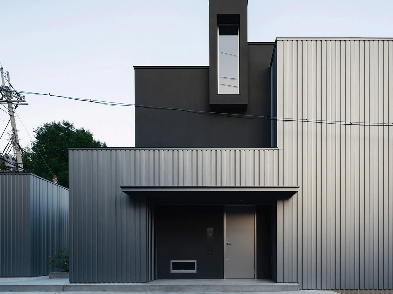
At FORM/Kouichi Kimura Architects’ Minimalist House, the route to the shower is part of the architecture. A glazed corridor crosses the gap between the main house and a separate washroom annex, preserving a view from the road toward the lake. Completed in 2026 on a hillside in Shiga Prefecture, the home is designed for one occupant. Its plan makes a case for treating the spaces between rooms as useful parts of daily life, rather than leftover areas to minimize.
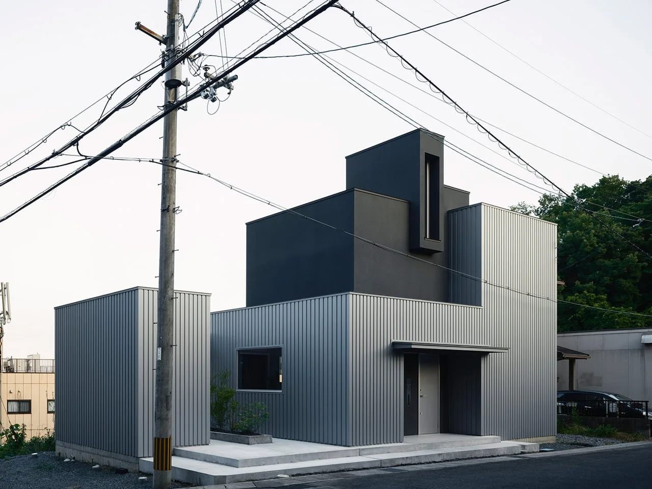
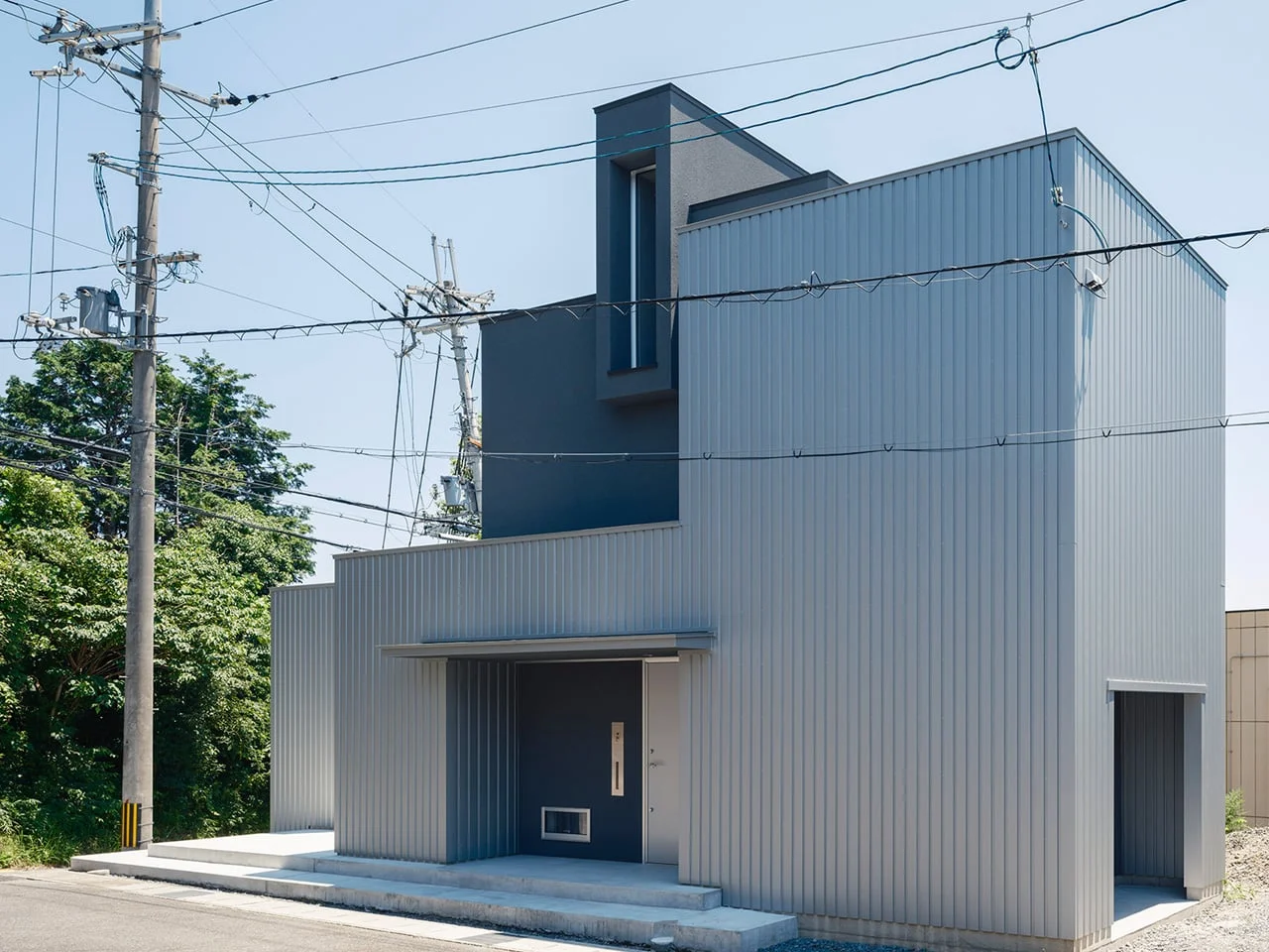
The house pairs a two-story main volume with a single-story annex for washing. That split gives the bathroom and shower their own place while keeping them connected to the rest of the home. The corridor is practical, but its glass enclosure also makes the trip visible and brings changing outdoor conditions into an ordinary routine. Here's the thing: a passage doesn't need to be a destination to shape how a house feels. In this design, the walk itself becomes a small encounter with the site.
The gap between the buildings serves another purpose. It maintains a clear sightline across the property, including a view from the road toward the lake. The arrangement makes separation do double duty: it creates a distinct setting for washing and leaves room for a visual connection beyond the house. That’s a precise architectural trade, especially in a compact residence where each part of the plan has to justify its presence.
Designer: FORM/Kouichi Kimura Architects
An open plan with distinct zones
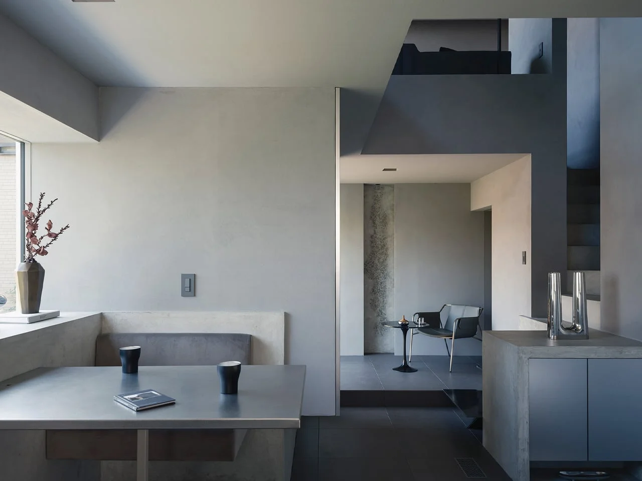
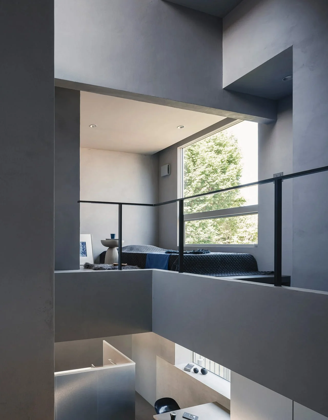
The main building places the kitchen and dining area downstairs, with living and sleeping spaces above. Both floors remain open and connect through a double-height interior. Shifts in floor and ceiling height mark changes in use without closing each area off with walls. That gives the home a sense of internal order while preserving long views through the rooms. The distinction is architectural, not a matter of adding doors between every activity.
Windows shape that experience from specific vantage points. Instead of presenting the whole landscape in one broad view, the architects frame selected scenes from within the house. Each opening gives a particular position a reason to matter: what you see from one area may differ from what draws your attention elsewhere. The lake becomes part of the home through a series of views, rather than a single panoramic backdrop. A quieter approach to scenery, and a more deliberate one.
This framing also affects how the interior reads. A window can make a view feel like a feature of one room without requiring that the entire floor be organized around it. The house’s open plan and its selected sightlines work together: the rooms remain visually connected, while each position can still have its own outlook. If you're working in this space, that balance is familiar—the challenge is to make openness feel considered, not simply empty.
Space for sound and changing light
The upstairs living area also serves as a place to listen to music. The project description says sound can travel through the tall room and reflect from its walls and ceiling; it presents this as a design intention, not measured acoustic performance. That distinction matters. Room height and hard surfaces can shape how sound is experienced, but the available description doesn't establish how the space performs in practice. The room is conceived as part of listening, not just as a container for furniture.
A high vertical window brings daylight into the space, casting shadows that shift across the floor and walls through the day. Light, like sound, changes the character of a room without requiring another partition or fitting. The effect is temporal: the interior isn't experienced as a fixed image, but as a place whose appearance moves with the daylight. And yet, a tall room can also make a modest home feel more expansive than its footprint suggests.
The studio’s approach starts with one person’s habits rather than adapting a standard family-house plan. That brief helps explain why the living and sleeping areas stay open while washing facilities sit in another building. For a single occupant, the design can prioritize visual continuity without needing to separate several household activities at once. This is more significant than it looks: the layout follows the stated pattern of use, rather than treating a conventional room arrangement as the default.
That choice has limits as well as advantages. The separate washroom means the route between buildings is part of everyday use, so the corridor has to work as a real connection, not merely as a striking image. Its glazing and position give that walk architectural purpose, but the project description doesn't explain how the passage feels in different weather or at different times of day. Those details would shape the daily experience. The design’s central idea is clear even without them.
Minimalism through selective separation
Here, minimalism depends on choosing where separation adds value. The annex gives washing a dedicated setting; elsewhere, changes in height and carefully placed windows define space without more walls. The corridor is the clearest expression of that logic: a small amount of space between buildings becomes a daily connection to the site. Not decoration alone. Its role is functional, visual, and experiential at once.
What this means for you as a reader is that the house's restraint shouldn't be mistaken for a lack of decisions. Its openness depends on carefully distinguishing activities, views, and transitions. The main volume gathers cooking, dining, living, and sleeping into a connected arrangement, while washing occupies a separate structure. The approach asks whether every boundary needs to be a wall, and answers with changes in level, ceiling height, and distance between buildings.
What the plan suggests
The project offers a useful example of how a small home can make circulation part of its lived experience. In many houses, corridors are treated as necessary space to pass through; here, the glazed link has a view and a relationship to the landscape. That doesn't make the walk disappear as a practical task. It gives the task a different setting, and makes the connection between buildings legible.
There’s also a clear trade-off in the design’s priorities. Open rooms and framed views can create visual continuity, while the annex gives one set of activities a separate address. For this single occupant, that arrangement appears to support a less compartmentalized interior. Whether it would suit different routines is a separate question; the project is presented around one person’s habits, and its logic follows that brief.
As a piece of architecture, the most persuasive move may be the gap itself. The home doesn't try to absorb every function into one uninterrupted volume. Instead, it uses the distance between two buildings to preserve a view and make an everyday route meaningful. A modest intervention. The house’s broader lesson is that space between rooms—or between buildings—can be designed with as much care as the rooms themselves.
The post This Minimalist House in Japan Turns the Walk to the Shower Into a Landscape Moment first appeared on Yanko Design.



Discussion
Sign in to join the discussion.