Jonas Krämer’s Compath concept pairs a tactile Home button with visual and audio cues, keeping dementia navigation focused on familiar routines.
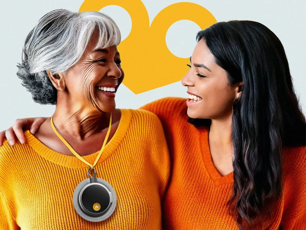
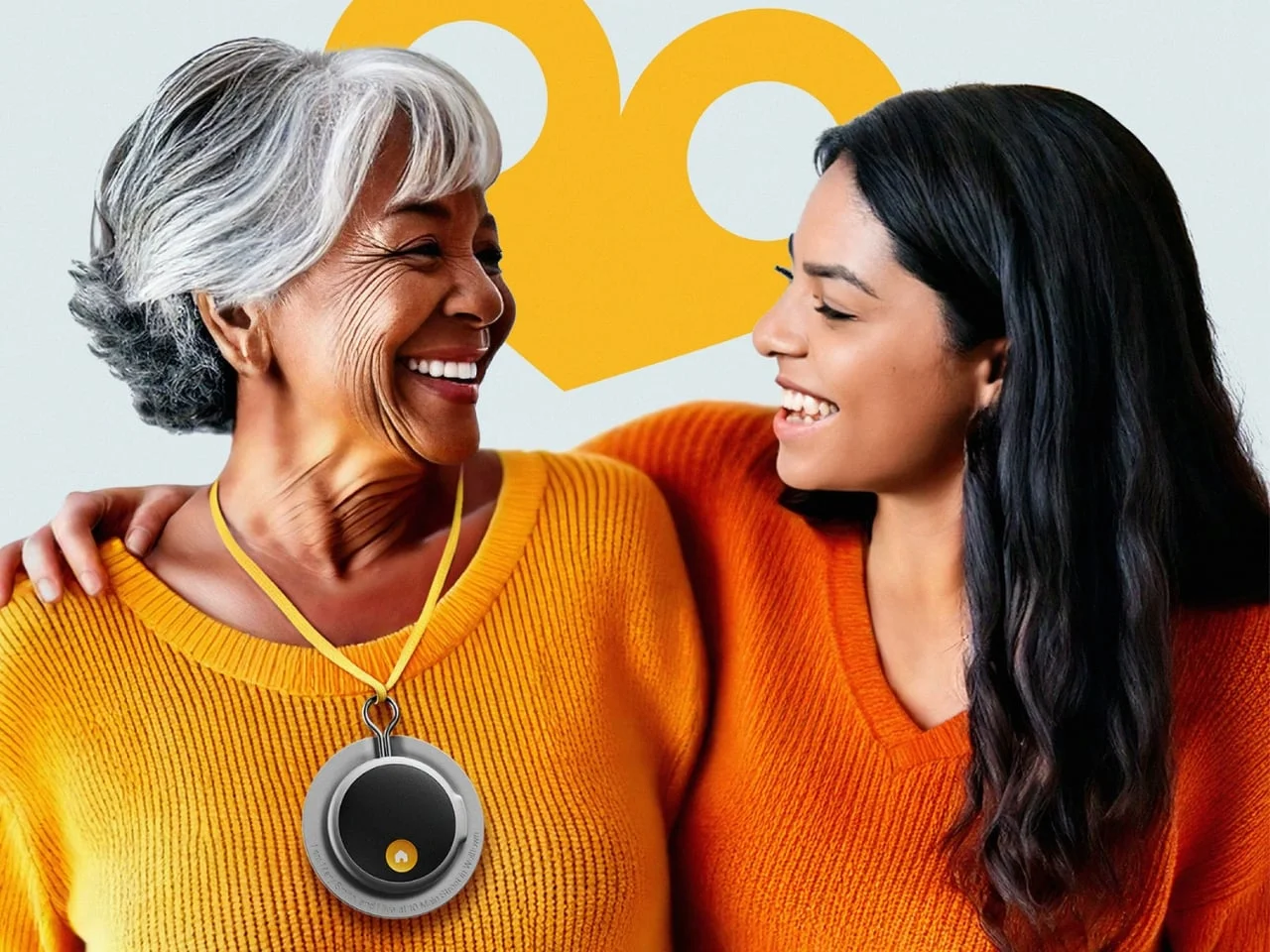
Navigation built around a single action
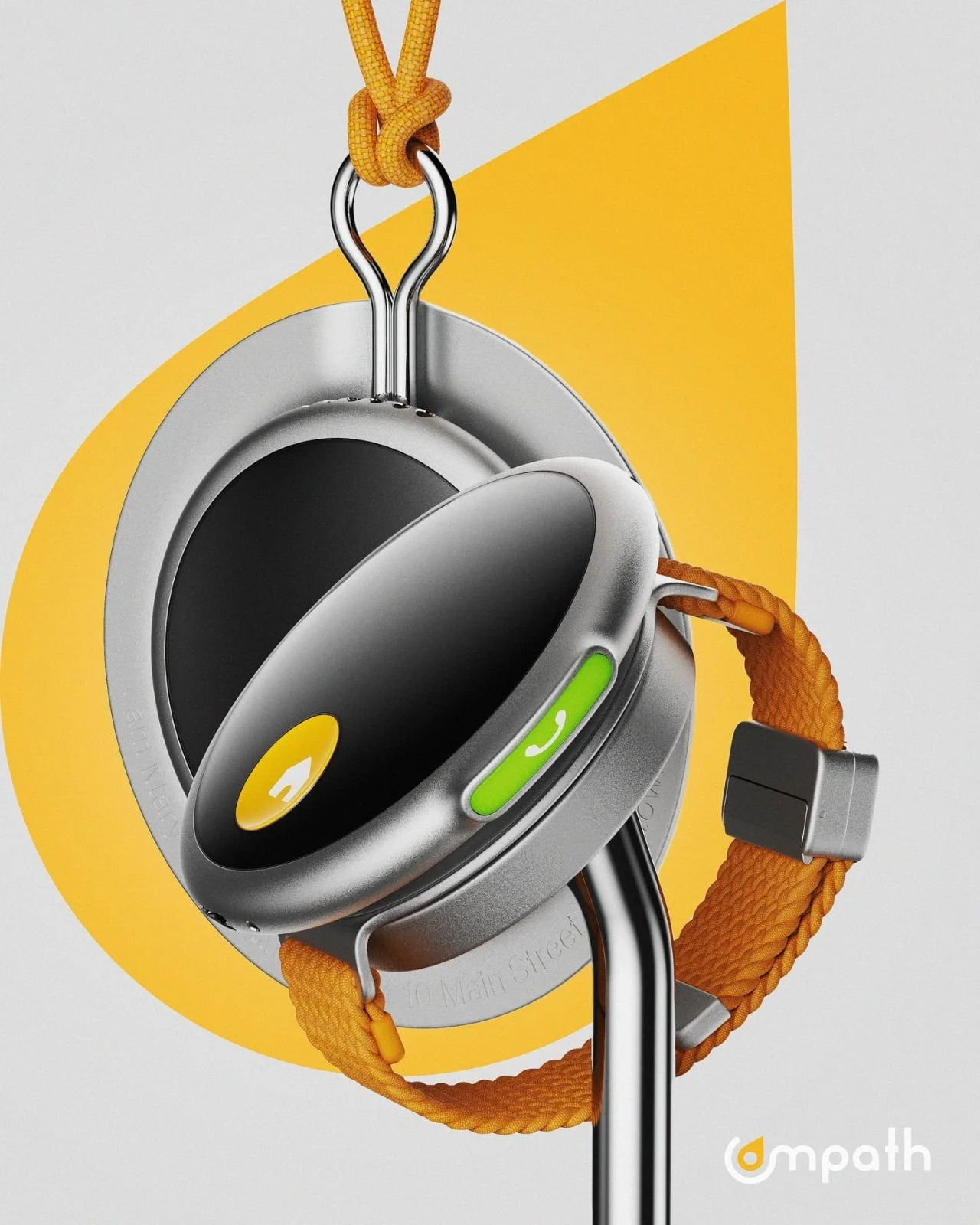
For a person with dementia, finding the way home can involve more than knowing their location. A smartphone may add menus and touch controls at the moment clear, direct guidance matters most. Compath, a wearable concept by designer Jonas Krämer, takes a different tack: put a familiar destination within reach through one prominent yellow Home button.
That focus on the wearer’s experience gives the concept its strongest idea. Location information can help caregivers, but the person out walking also needs guidance they can access and understand. Compath proposes visual and audio cues, with the button directing its wearer home or to another designated place. Here's the thing: the most useful interface may be the one that asks the wearer to remember the least when they’re already unsure where to go.
This is more significant than it looks. Many digital navigation tools assume a user can interpret a map, choose a destination and move through several controls. Compath instead makes the intended action legible at a glance. That simplicity is promising, though it still depends on the cues being understandable and the route being dependable.
Designer: Jonas Krämer
A wearable designed to feel personal
Compath was one of seven finalist projects in the 2025 RIMOWA Design Prize. It remains a design concept, rather than a product with demonstrated performance, so its value lies in the questions it raises about usability and care. A prize shortlist can draw attention to a design direction; it can’t establish how the object performs in everyday conditions.
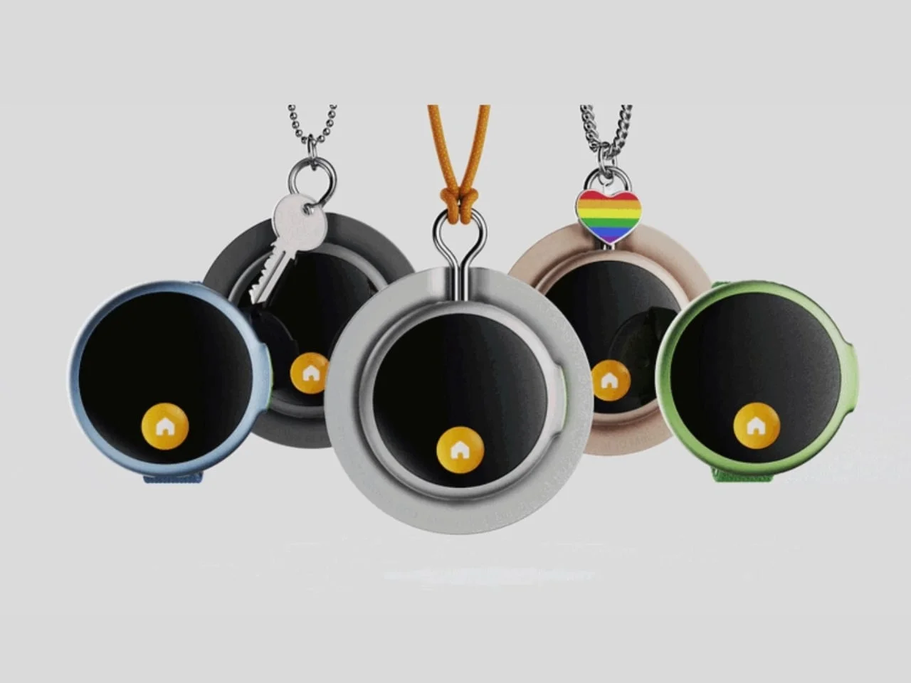
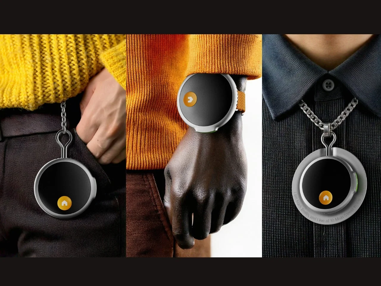
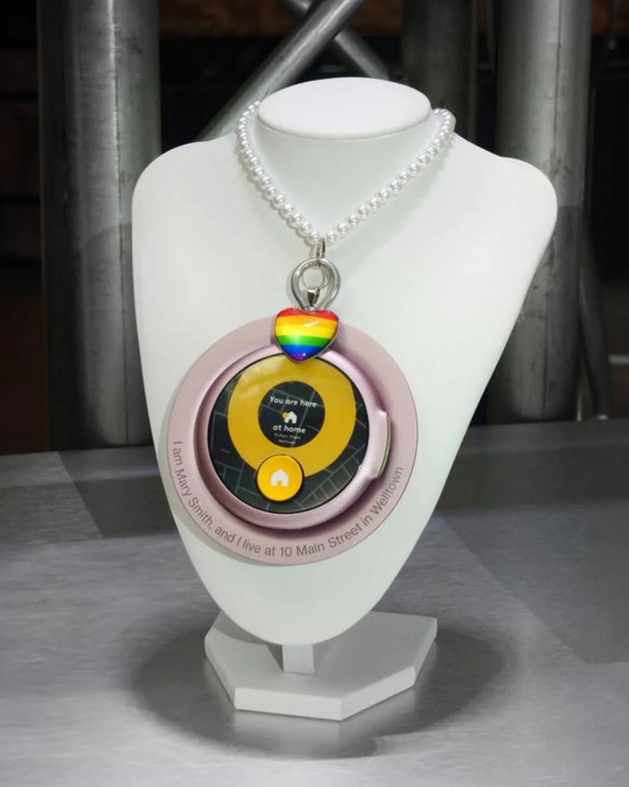
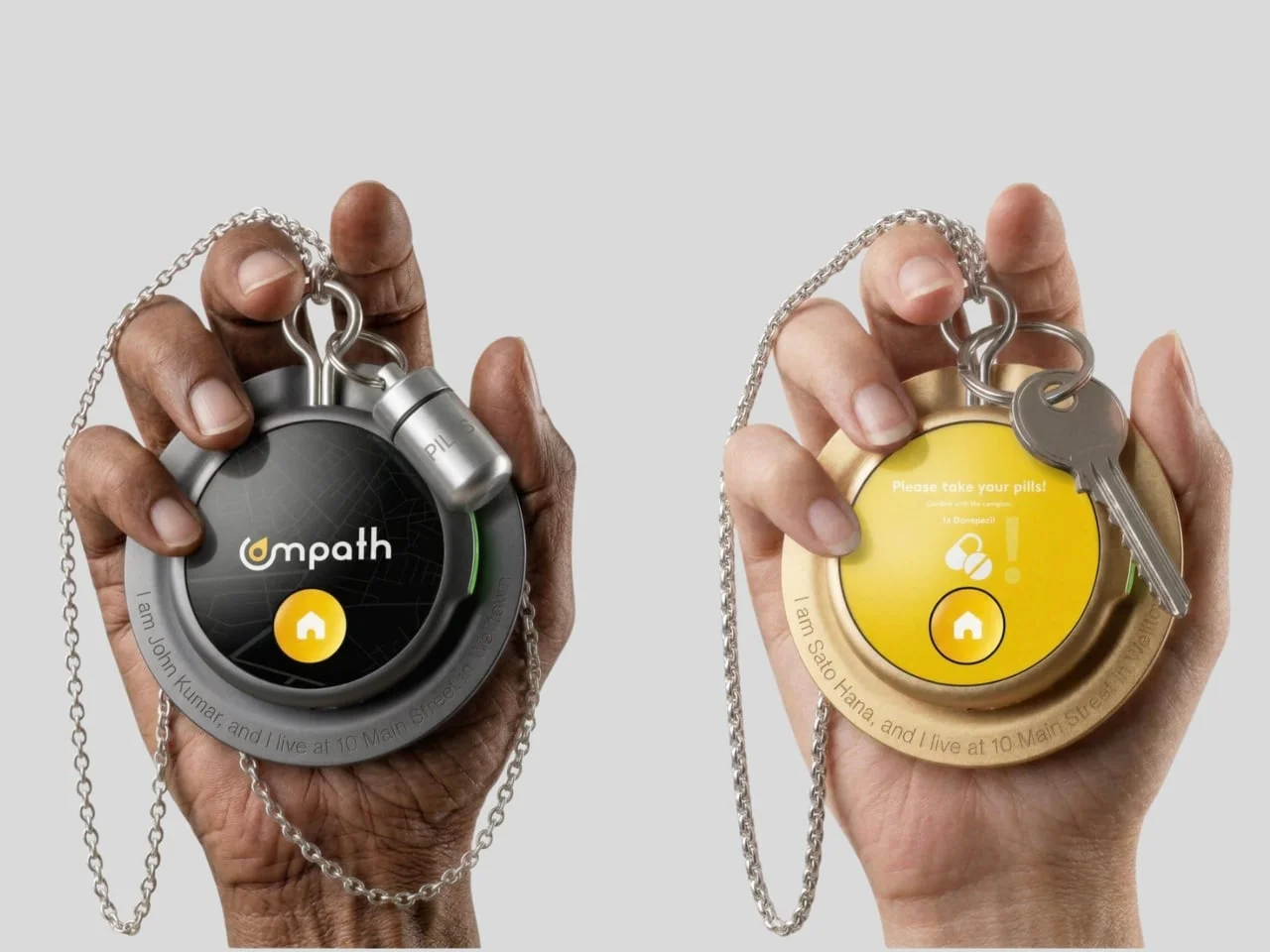
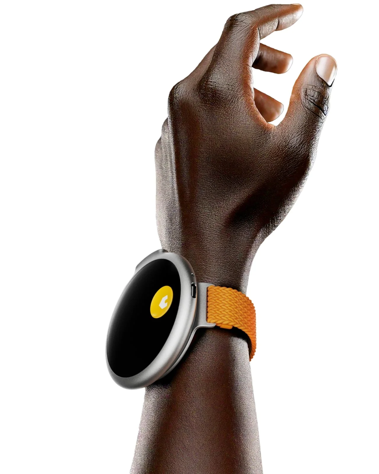
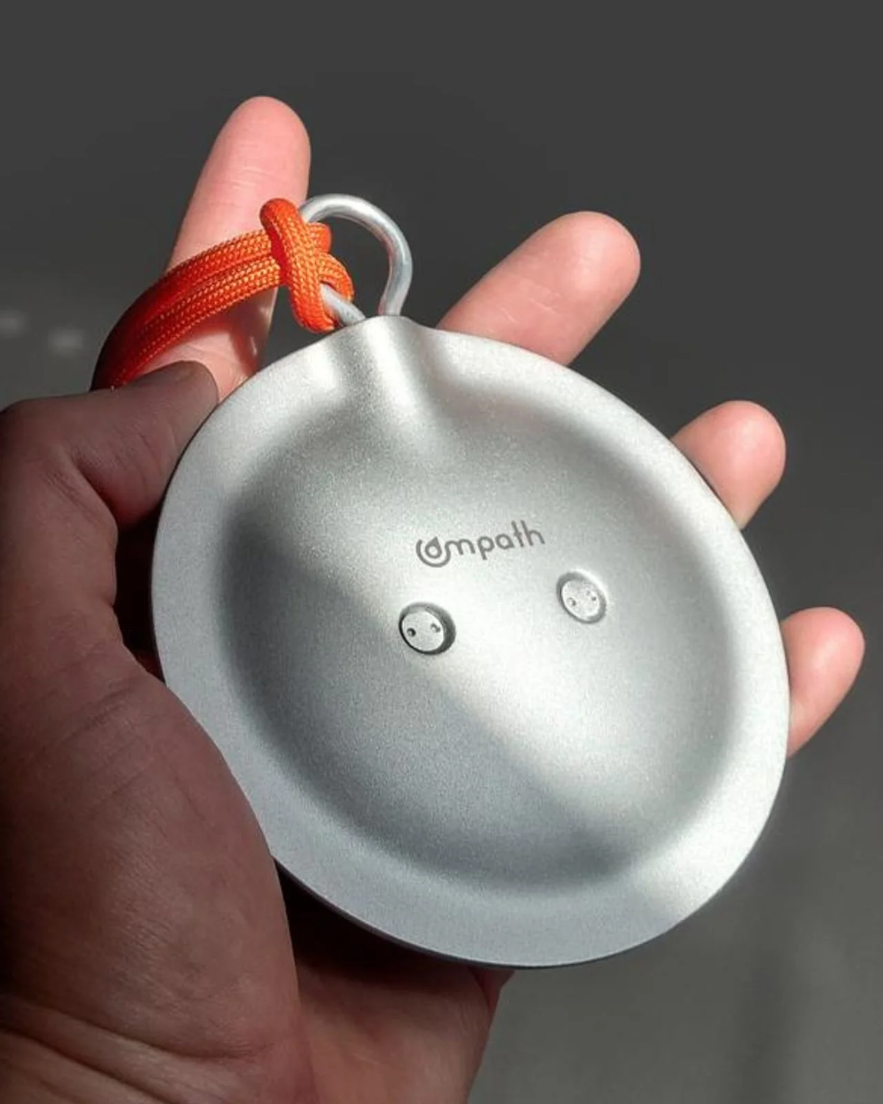
In the published images, Compath has a round body, a dark central face and a thick outer ring. Its yellow Home button stands out against the rest of the device. The concept is shown on cords and chains, with a key and a rainbow heart charm appearing beside two versions. These styling choices suggest a wearable that could fit into someone’s personal routine and taste, rather than looking like standard medical equipment.
That distinction matters because a support device only helps when it’s carried. A clinical appearance may make a device feel like something imposed by others, while familiar accessories can make it easier to adopt as part of a daily routine. The concept’s charms and different ways to wear it point toward choice, though personal appeal can’t be assumed from product images alone. A wearer’s preferences may change, too.
Guidance without a menu
The proposed interface leaves out touch controls and complex menus. Instead, visual and audio prompts would help with directions and reminders, while the Home button provides a direct route to a chosen destination. The approach keeps the interaction simple on paper, where each extra step could make a device harder to use when someone is already disoriented. The concept also shifts the burden from navigating an interface to recognizing a small set of signals.
That shift raises practical questions. Visual prompts need to be easy to see and interpret, while audio cues need to make sense in the wearer’s surroundings. The materials don’t describe how those channels work together or what happens if a wearer misses one. A plain interface is a useful starting point, not proof that the interaction will remain clear during a stressful moment.
Compath also introduces a Safe Zone, set collaboratively by the wearer and caregivers around familiar places and routines. Leaving that area would trigger an alert. Involving the wearer in defining the boundary is a meaningful design choice; the way alerts are handled and what location details are shared would also shape whether the system feels supportive in daily use. If you’re working in this space, that balance between practical oversight and the wearer’s sense of control is central to the design.
And this is the part most people overlook: a boundary is only useful if it reflects the person’s ordinary life. A zone that’s too narrow could turn routine movement into repeated alerts; one that’s poorly understood could leave caregivers unsure how to respond. The concept establishes a collaborative process, but its everyday value would depend on how easily that arrangement can be reviewed as routines change.
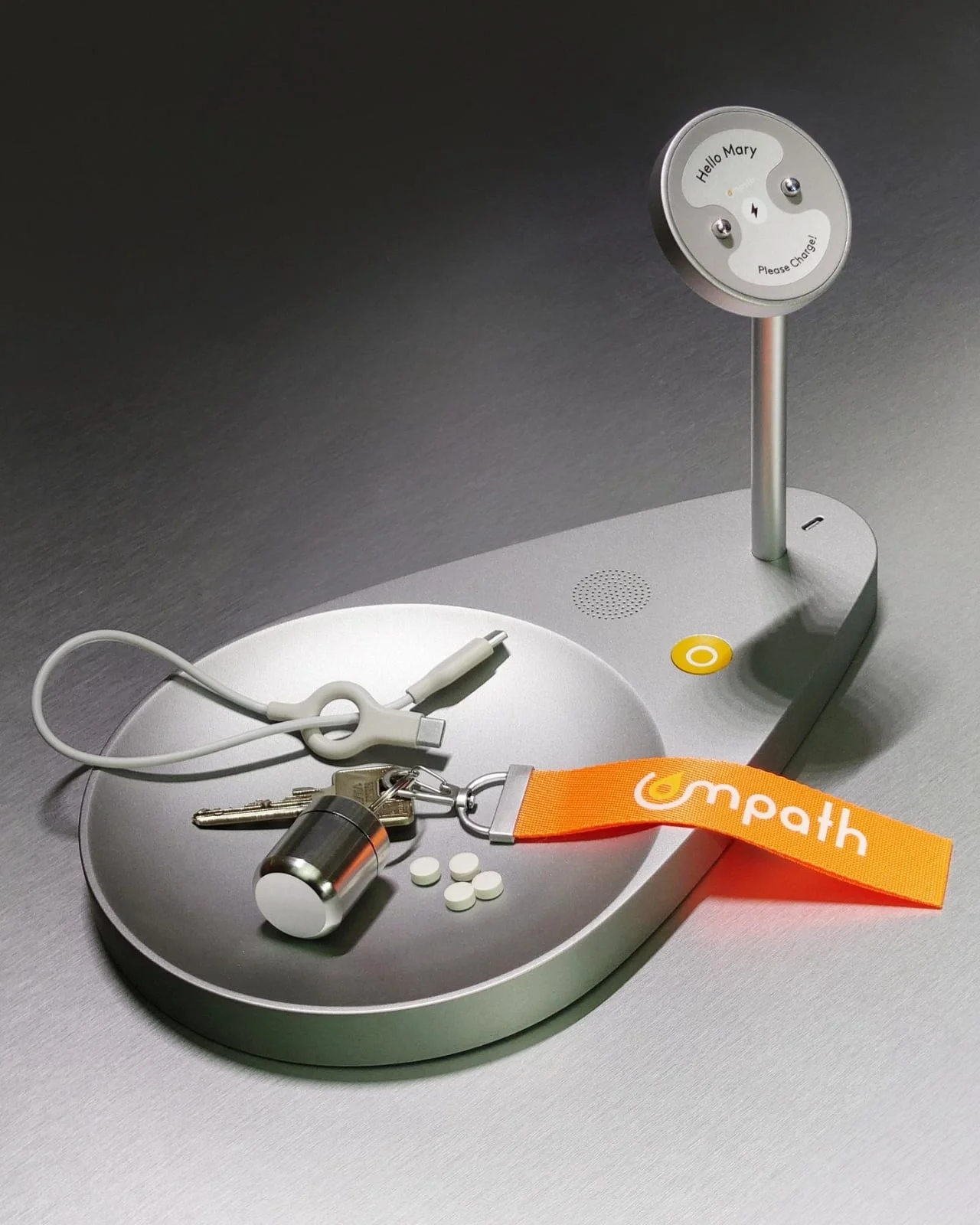
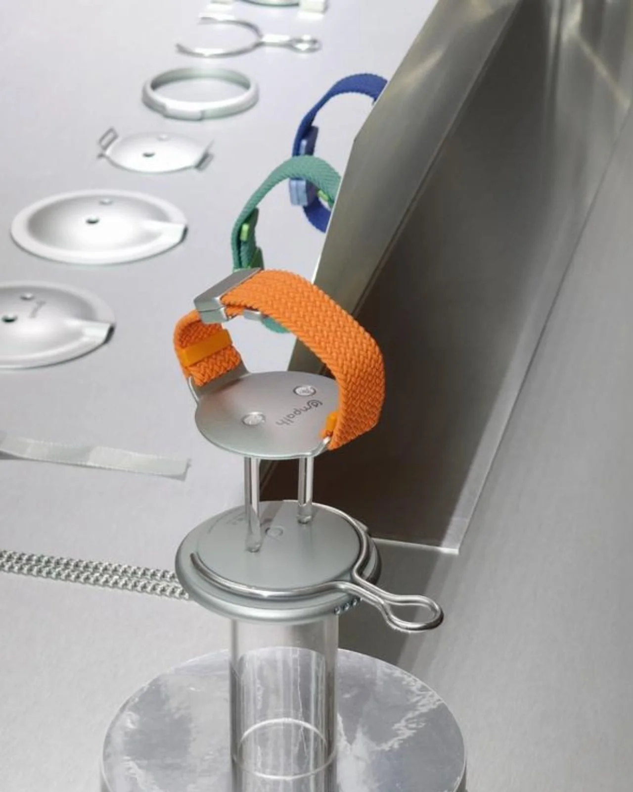
At home, a charging dock called the Lighthouse gives the wearable a designated place, alongside everyday items such as keys or medication. That detail extends the idea beyond the walk itself: a wearable has to be easy to find and charge before it can be useful outdoors. It also treats charging as part of the care routine, rather than an afterthought. A dock can give the device a predictable home, though it can’t help if the wearer leaves without it.
From a clear concept to dependable use
The accessory-like styling points to a broader question: can a support device be recognizable as someone’s own without advertising their medical history? Compath’s cords, chains and charms give personalization a visible role. Whether those details feel comfortable or familiar will vary from person to person, but the concept treats personal taste as part of the design brief. That’s a welcome shift in emphasis: dignity can depend on how a device fits into a person’s life, as well as what it does.
Practical use would depend on details the concept materials don’t resolve, including battery life, connectivity and location accuracy. Designers would also need to account for missed cues and for people with different abilities or changing needs. A clean interface in a presentation doesn’t answer what happens when guidance fails to register during an actual walk. The numbers here are underwhelming because there aren’t product performance results to assess yet; the concept invites questions more than it answers them.
Similar location-based systems typically depend on several parts working together: a device must determine where someone is, communicate that information and present guidance in a form the wearer can act on. A failure in any one part could weaken the experience, even if the button itself is easy to find. Compath’s materials don’t specify those technical details, so claims about reliable navigation would be premature.
Compath’s most compelling premise is modest: make it easy for the wearer to ask for help, and give them a reason to keep the device with them. Its next test would be whether that simple button, the guidance system and the wearable’s personal appeal hold up together in everyday use. The hard part is making all three work as one.
What the concept leaves open
Compath points to a useful standard for assistive design: support should be understandable to the person using it, not only reassuring to the people around them. The Safe Zone and caregiver alerts may help coordinate support, but the wearer’s own experience has to remain central. A system can offer more oversight while still feeling intrusive if its boundaries and signals don’t make sense to the person carrying it.
That said, the concept’s strongest contribution is a question rather than a finished answer. Can a wearable offer enough guidance to help someone return to a familiar place while remaining simple, personal and dependable? The design makes a clear case for a direct button and everyday styling. Its value will depend on whether real use supports that promise.
The post Compath Imagines Dementia Navigation Without a Touchscreen first appeared on Yanko Design.


Discussion
Sign in to join the discussion.