LAWA’s Gradient Watch tracks hours and minutes through overlapping rotating discs, trading familiar markers for a changing, minimalist dial.
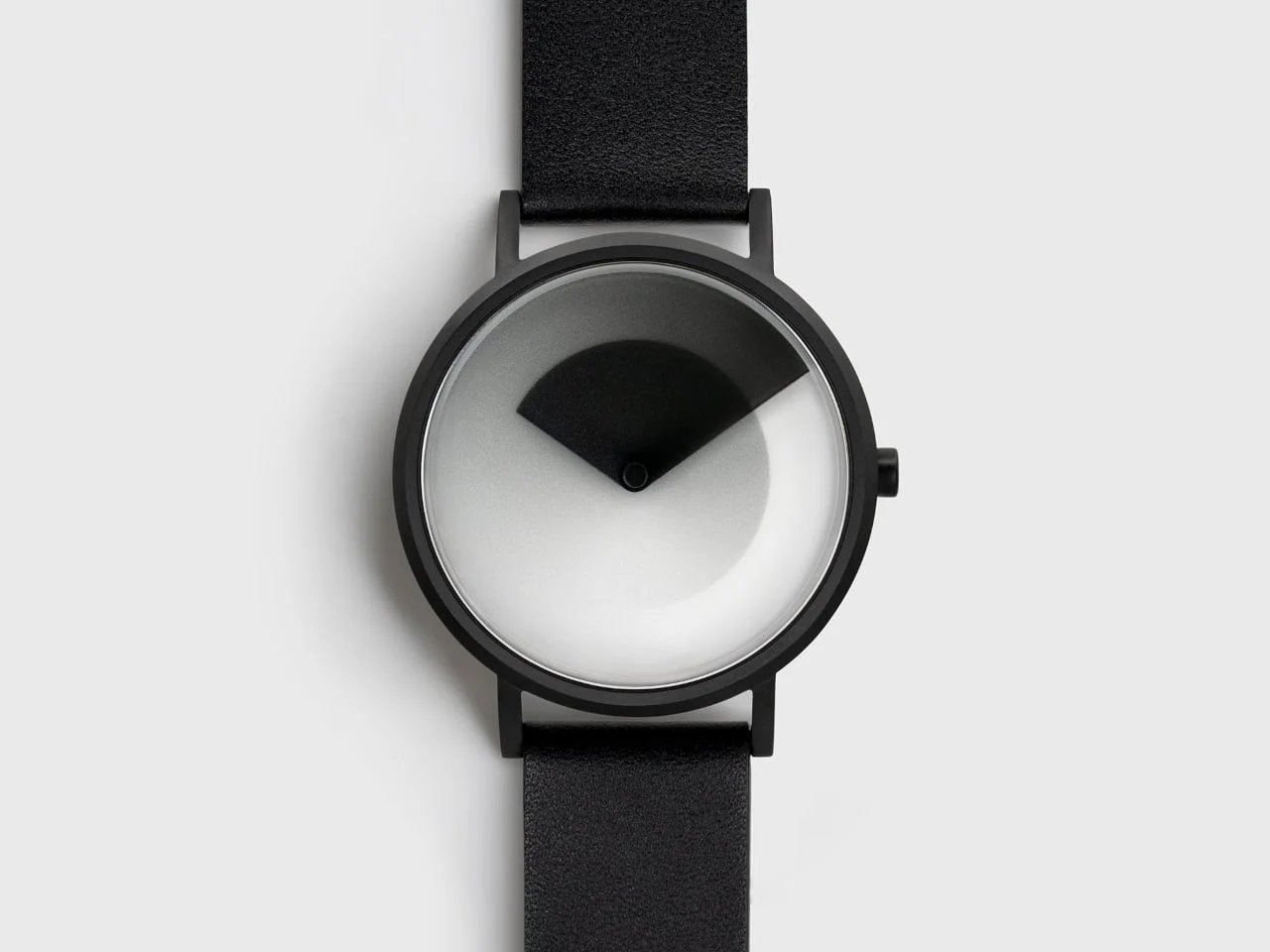
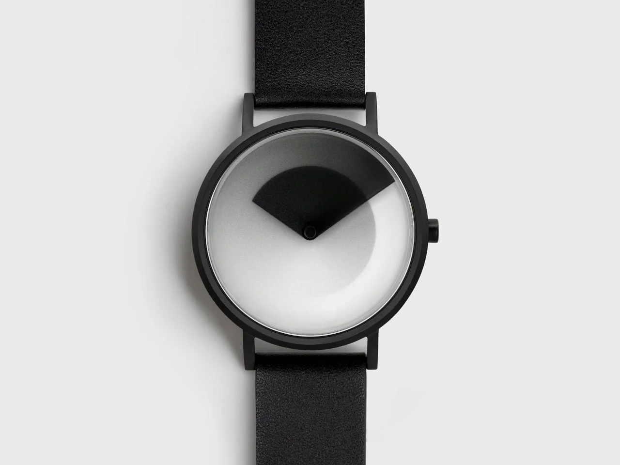
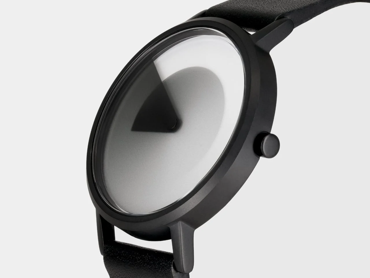
LAWA Design’s Gradient Watch makes the dial itself do the work of telling time. Two translucent discs rotate at different rates, blending their gradients into shifting light and dark regions that represent hours and minutes. The result is less immediately legible than a conventional watch face, but it gives time a visible rhythm without adding a screen.
That puts the watch in a familiar design tradeoff: a display can be easy to read, or it can make the act of checking time feel different. Here, the answer is to turn the dial into a small, changing composition. You don’t read a hand against fixed marks; you interpret how the two colored layers meet. It’s a clear design choice, though one that asks the wearer to learn a new visual language.
A dial built from motion
Designed by Ewa Bryzek and Allen Shakir, the watch uses the overlap between its discs as its main visual cue. As each layer turns, the tones combine in new ways; the display at breakfast won’t look the same by lunch. That pattern comes from the watch’s timekeeping, not a digital animation. The LAWA Design Gradient Watch is powered by a Japanese Miyota 2025 quartz movement.
The distinction between a moving mechanical display and a screen matters to the product’s identity. The changing colors aren’t an animation added for effect; they’re the visible consequence of the watch’s two rotating parts. That gives the dial a physical quality a static face can’t offer, while keeping the underlying timekeeping familiar. Quartz handles the timing, and the discs translate it into a less conventional display.
It’s a restrained idea with a specific payoff: the watch can look different over the course of a day without changing what it is. The face becomes something to observe, as well as a tool for checking the hour. That shift won’t suit everyone. But it gives the design a reason to exist beyond a new colorway or case shape.
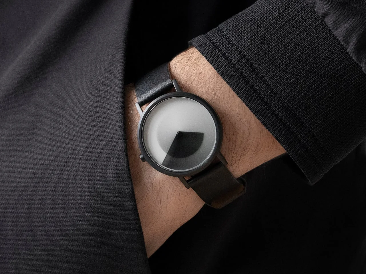
The familiar parts stay restrained: a round 1.5-inch case made from 316L stainless steel, slim lugs, and a small side crown. In black, a matte case and pale dial keep attention on the layered gradients. There’s no busy hardware or prominent branding competing with the display.
That simplicity helps the central idea stay readable as a design, even if it doesn’t make the time itself instantly clear. The case provides a conventional frame for an unconventional face. Slim lugs and a small crown keep the surrounding hardware quiet, so the eye goes first to the color fields. A watch can’t escape the practical details of its case, but this one keeps them from becoming the main event.
Color and materials shape the look
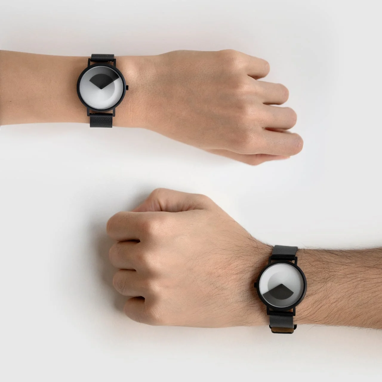
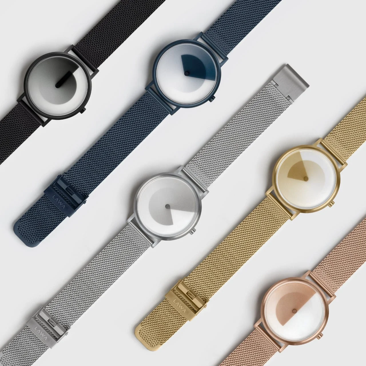
The range extends beyond black. Navy Blue and Pine Green shift the dial’s palette, while Silver, Gold, and Rose Gold change the case finish around the same design. Leather and stainless steel mesh straps let owners tune the watch’s character, from understated to more jewelry-like. Both have quick-release fittings, so swapping bands takes no tools.
Those options do more than add variety to a product page. Color changes the mood of a dial built around blended tones, while the case finishes determine whether the effect feels quieter or more decorative. The same core display can therefore sit in noticeably different visual settings. That’s useful for a design whose first impression depends heavily on color, though the choice won’t alter how its time display works.
The straps offer a practical way to shift the watch’s style after purchase. Leather tends to make a watch feel more traditional, while mesh brings a more metallic presence; here, those familiar associations sit beside a dial that refuses the usual hands and markers. Quick-release fittings make that change easy to try. It’s a small feature, but it supports the idea that the watch can be adjusted to suit different occasions.
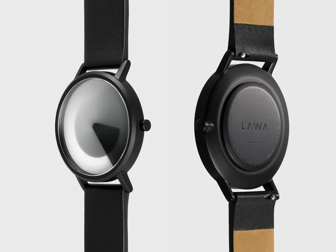
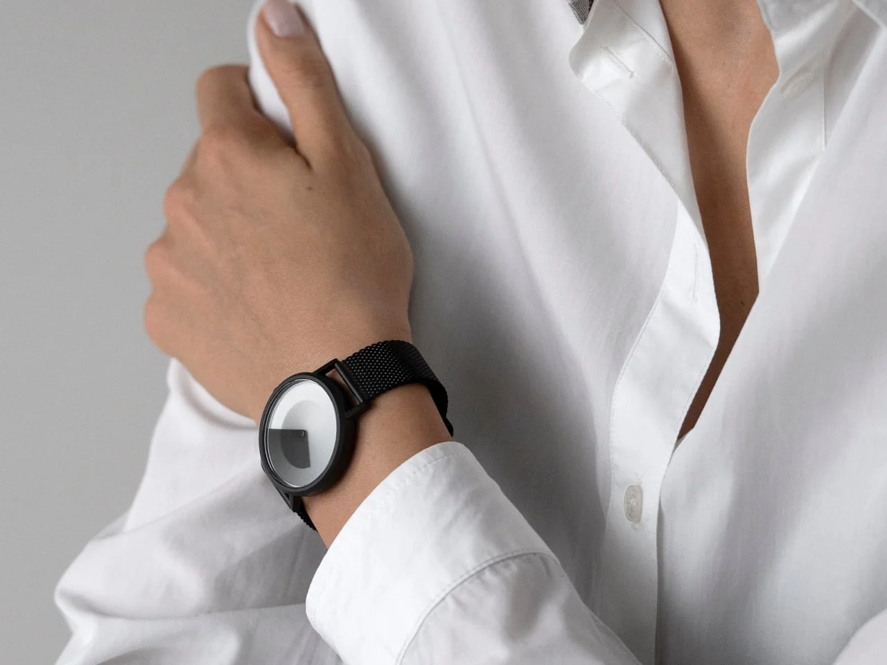
Those strap choices also change the weight: the leather version comes in at 1.48 ounces, compared with 2.40 ounces for mesh. The watch has sapphire-coated mineral crystal and 5 ATM water resistance. Its quartz movement keeps the experience simple, with no apps, menus, or notifications to manage.
The weight difference is substantial enough to matter to someone who notices a watch on the wrist, particularly over a full day. The mesh option adds nearly an ounce compared with leather, according to the listed figures, so the materials affect the wearing experience as well as the look. The stated water resistance and crystal coating add conventional watch specifications to a design that otherwise leans on visual novelty. They don’t change the basic proposition: this is a timepiece built around its dial.
And the lack of connected features is part of that proposition. There’s no phone setup, notification stream, or menu system to learn. For some buyers, that’ll feel refreshingly direct; for others, it means the watch offers fewer functions than a connected device. A quiet wrist. That simplicity works best if the wearer wants a watch to tell time and provide a distinctive visual object, rather than act as another screen.
Minimalism comes with a reading tradeoff
Here’s the thing: removing hands, numerals, and minute markers also removes familiar reference points. The wearer has to read the shaded areas rather than match a pointer to a scale. That makes the Gradient Watch’s display expressive, but potentially less useful when timing matters precisely. Its appeal rests on accepting that exchange: a dial that changes like a composition, at the cost of a quick, exact glance.
That cost isn’t merely a matter of taste. Conventional watch faces use fixed marks to help the eye estimate time quickly, and people learn those visual conventions through repetition. A display based on overlapping gradients asks for a different kind of reading. The wearer may become more comfortable with it over time, but the design still gives up some immediate precision in exchange for a more atmospheric view of time.
This is more significant than it looks. The Gradient Watch makes a familiar object less efficient at its basic task in order to make that task more visually engaging. That’s a defensible choice for a fashion-led watch, but it should be understood plainly. If you’re working in a setting where a fast glance matters, the lack of markers could become irritating; if you mostly check the time casually, the changing dial may be the point.
(And this is the part most people overlook.) A less literal display can change how often someone looks at a watch and what they expect to get from it. The Gradient Watch doesn’t appear to promise the speed of a standard dial. It offers a reason to pause over the face instead. Whether that feels rewarding or inconvenient will depend on the wearer, not on the movement alone.
What the design asks of its wearer
LAWA Design’s approach shows how much of a watch’s character can come from the interface between its mechanism and its face. The quartz movement keeps the timekeeping conventional, while the rotating discs turn that familiar function into an abstract display. That combination gives the product a clear identity without relying on a screen or a complicated feature list. It also makes the core compromise impossible to ignore.
For a buyer choosing among the finishes and straps, the key question isn’t simply which color looks best. It’s whether the experience of reading time through changing shades feels appealing enough to outweigh the missing reference points. The case, materials, and quick-release bands support the design, but they can’t solve that question for the wearer.
The watch’s strongest claim is its restraint: it uses motion and color to make time visible, then leaves the rest of the experience uncomplicated. That won’t make it a universal daily watch. It may make it a memorable one for people who value the dial as an object in its own right.
The post LAWA’s Gradient Watch Uses Rotating Discs Instead of Hands first appeared on Yanko Design.



Discussion
Sign in to join the discussion.